The science behind packaging design: How the brain chooses what we buy
28/05/2025 | Read
When it comes to product packaging, most decisions aren’t made with logic on a conscious level.
Before consumers even register what your product is or what it says, their brains have already formed an opinion. That opinion often dictates whether they reach for your product or walk away.
This is where neuroscience and behavioral psychology meet design. In this article, we explore how understanding the human brain can help brands create packaging that doesn’t just look good – it sells.
First Impressions Happen in 0.2 Seconds
Studies show the human brain can form a first impression in as little as 200 milliseconds—faster than the blink of an eye [1]. Consumers don’t read first; they respond to color, shape, layout, and emotional tone through System 1 thinking – the brain’s fast, automatic, instinctive mode described by Daniel Kahneman [2]. System 1 is intuitive. It reacts to visual cues and emotional signals without conscious analysis. If your packaging doesn’t send the right message in that tiny window, your product risks being dismissed.
“What feels right often sells better than what sounds right.” A.K. Pradeep [3]
This explains why beautiful packaging alone isn’t enough. Design needs to trigger the right instincts. To do that, we need to understand how packaging communicates with the brain.
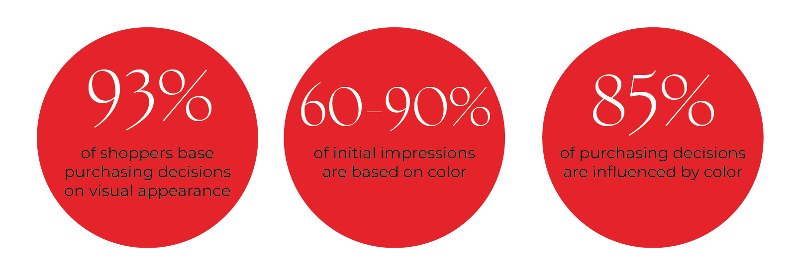
Color: The Emotional Shortcut
Color is one of the fastest ways to convey a feeling. Research shows that up to 90% of snap judgments about products are based on color alone [4]. It immediately signals the product’s tone, category, and perceived value. For example:
Red creates urgency, appetite, and excitement. It's often used in snacks and impulse-buy categories.
Blue evokes trust, calm, and hygiene. Common in pharmaceutical and health-related products.
Black and gold are associated with elegance, exclusivity, and premium positioning.
Green cues natural ingredients or sustainability—but if the design feels off, it can come across as disingenuous.
In a 2025 EEG-based neuromarketing study, bright, high-contrast color schemes were found to evoke stronger emotional engagement and higher perceived quality ratings than dull or low-contrast designs [8]. Another 2024 study identified gender-based color perception patterns, highlighting that men and women may respond differently to certain hues in terms of trust and interest [12]. This opens up an opportunity for segmentation-driven design strategy.
Shape: Trust Built by Form
The brain is drawn to order. Shapes and visual balance affect whether a product feels familiar, premium, or confusing. This is governed by the principle of cognitive fluency—the idea that things we process easily are more likely to be liked and trusted [5].
Rounded shapes feel safe and approachable.
Sharp edges feel bold, edgy, or aggressive—great for performance products.
Centered layouts feel controlled and formal.
Asymmetrical designs can spark interest but must be carefully balanced.
Ergonomic forms improve handling and boost emotional satisfaction.
A 2025 EEG study on packaging ergonomics found that consumers formed stronger emotional connections
with packs that felt more comfortable to hold [9]. This was especially true for
Layout: The Logic Behind the Scan
In-store, consumers scan packaging for just 5 to 7 seconds [10]. During this time, their eyes follow a pattern shaped by design cues, category knowledge, and emotional resonance. Visual hierarchy matters.
A well-structured layout leads the eye and reduces decision fatigue. Here's a proven sequence:
Brand logo or product name – for recognition.
Emotional hook – an image, illustration, or short headline.
Key product benefit – feature or differentiator.
Support info – certifications, ingredients, flavor, or usage.
In EEG + eye-tracking studies, packages that used this structure held viewers’ attention longer and improved brand recall [11]. Conversely, crowded, inconsistent layouts caused confusion and visual fatigue.
Emotional Tone: Why Familiarity Wins
We are hardwired to trust what we recognize. This is known as the mere exposure effect—the more familiar something feels, the more likely we are to like and choose it.
That’s why:
Consistent color schemes across SKUs help build memory.
Category codes (like bottle shapes or cap colors) offer navigational comfort.
But packaging must also avoid monotony. Visual “micro-disruptions” such as a diagonal cut, unexpected texture, or stylized label element can interrupt automatic scanning and spark curiosity—without creating confusion.
Conclusion
Today’s packaging must do more than protect a product. It has to attract attention, trigger emotion, build trust, and convert curiosity into purchase—all in a few seconds.
Neuroscience and consumer behavior research help us design with intent. By aligning design decisions with how the brain works, brands can:
Improve shelf visibility
Increase product interaction
Boost emotional engagement
Build loyalty through memory and trust
At LA VOL, we combine strategy, design, and behavioral insight to create packaging that resonates—visually, emotionally, and functionally.
Contact us to create packaging that connects with consumers on a deeper level—and performs at shelf.
References
If you want to know more check out our references:
Janiszewski, C. (1998). The influence of display characteristics on visual exploratory search behavior. Journal of Consumer Research, 25(3), 290–301.
Kahneman, D. (2011). Thinking, Fast and Slow. New York: Farrar, Straus and Giroux.
Pradeep, A.K. (2010). The Buying Brain: Secrets for Selling to the Subconscious Mind. Wiley.
Singh, S. (2006). Impact of color on marketing. Management Decision, 44(6), 783–789.
Reber, R., Schwarz, N., & Winkielman, P. (2004). Processing fluency and aesthetic pleasure. Personality and Social Psychology Review, 8(4), 364–382.
Gallace, A., & Spence, C. (2011). Tactile aesthetics. Social Semiotics, 21(4), 569–589.
Sappi. (2025). The Neuroscience of Touch: Global Packaging Study. [PDF].
Neuromarketing Lab, University of Mannheim. (2025). Color Contrast and Emotional Impact in FMCG Packaging: EEG Insights.
Affective Neuroscience Institute. (2025). The Shape of Trust: Ergonomic Packaging and Consumer Response.
Clement, J. (2007). Visual influence on in-store buying decisions. Journal of Marketing Management, 23(9-10), 917–938.
EyeSee Lab. (2024). How Shoppers Read Packaging: An Eye-Tracking + EEG Report. [Industry Report].
European Journal of Neuromarketing. (2024). Gender-Specific Color Perception in Packaging Design.